
I Daniel Blake follows the normal conventions of a DVD poster. It contains shots of different parts of the film on the back with a main center image on the front which represents the main part of the film and it's main characters. The poster contains block text with a blurb and the cast. The front cover contains the directors name and the screenplay directors name. It also has text above the title about the previous directors work to try and lure people in who might of seen that previous film. It also has the DVD logo and the distribution companies logo on it. The back contains a set of technical information about who its' produced by the companies in relation to it the age rating, what audio it uses, is it recyclable? The images lay out our main characters and gives a slight look into their situation to show us what it's going to be about without giving away the plot.
The positioning of Daniel in front of the mother and leaning towards her while carrying the shopping indicates a family figure. The family model of the father, mother, daughter and son indicates a wholesome feel while the children seem to be having fun. Daniel is also positioned in front of the mother and his taller than her to indicate that he is the main character of this film. It is also shown as being a documentary/ social realism film due to the fact of their clothing and where they are just in some back passage. The back cover shows the mother in distress with her children up against a tall bald man, the viewer wants to know why she is distress and that position, who is the tall man.
The program also uses share interest with the cover bringing up Ken Loachs previous film which was fairly popular. Due to the actors being fairly unknown the cover instead references Loach and his previous films to attract people, as his past films have been critically acclaimed.
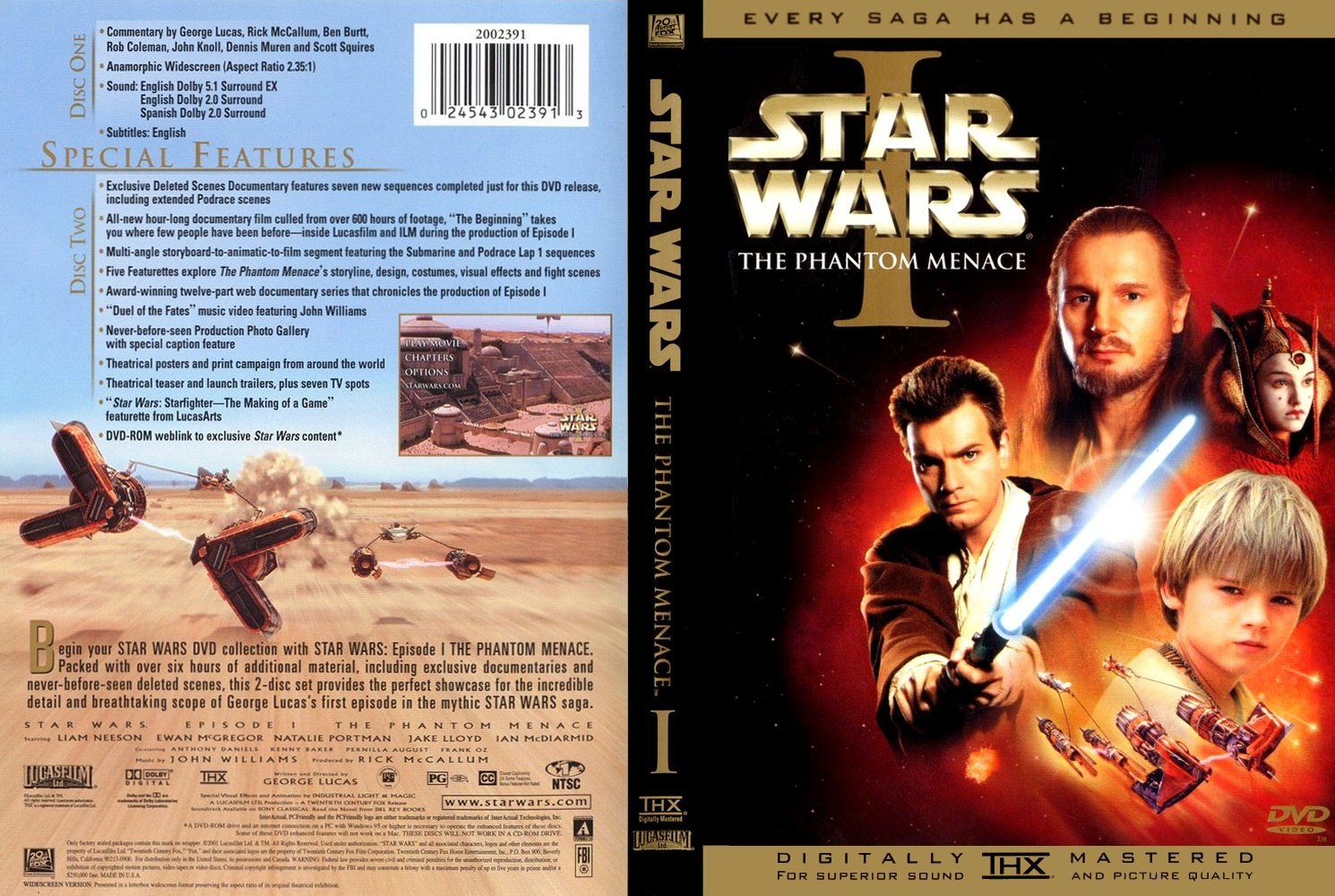 The Phantom Menace has a compilation of the main characters on the front typical of the star wars franchise. It contains the name in big bold text the the episode number in Roman numerals. The front has the episode catch phrase describing what the film is going to be about. The front has the usual conventions with the main characters what the film includes (pod-racing) it contains the name and franchise name with how the audio is done through THX and the production company Lucasarts with the distributor 20th century Fox. The back includes a blurb about the film, and the special features you get with the DVD with extra footage and behind the scenes. It also contains the companies which worked with Lucasarts and a image of one of the main shots. It also features the cast and some terms and conditions.
The front cover uses light around the main characters surrounded by dark which might indicate dark vs light which is a current theme in the star wars saga. Our main characters are placed in the middle with Qui Gon Jinn at the top acting like a father figure for the other cast who are significantly younger. The canter piece of the cover is also the blue lightsaber a known stable of Star Wars and known by most people due to it's presence in modern culture. The center piece is also the large bold text of STAR WARS which grabs the readers attention as majority of people know what Star Wars is and will probably watch is just because it's a Star Wars film. The subheading "The Phantom Menace" attracts people as they want to know what is the phantom menace is it a event of a person.
Clear and effective. You need a little more on semiotics and visual language. We can talk today
ReplyDelete