The Phantom Menace billboard shares similar conventions of a billboards with big bold text of the film and the release date to tell passers by when the film is going to be in cinema. It contains the main characters on the front stage. The billboard uses bright colours to attract passers by. It also has a bold slogan "see it on the big screen". It also has clear text with the typical star wars font with the large 3D logo to show it off as having 3D capability.

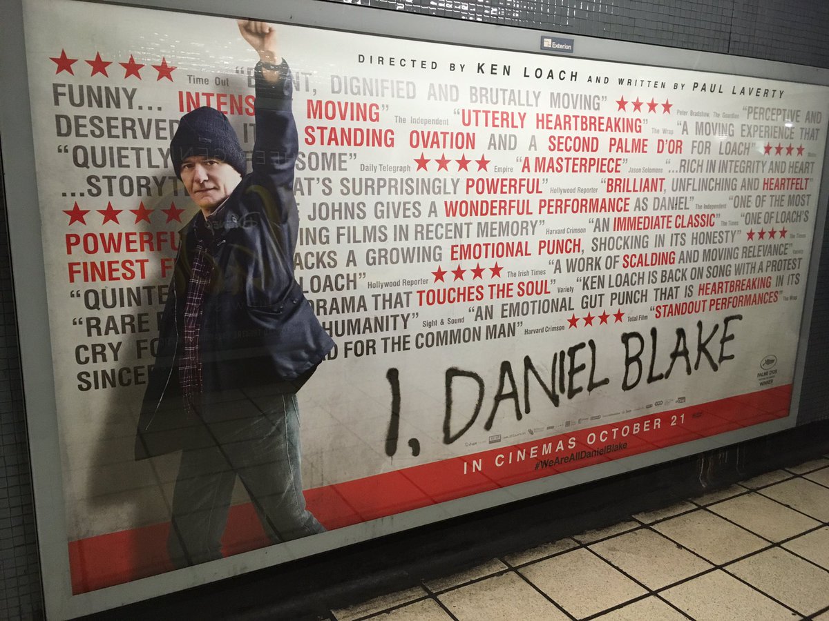
I Daniel Blake has a different look to the other billboard instead showing reviews as the main stand point to the film attracting people to it due to it's good reviews. The poster also has a clear colour scheme with red and black which attracts the eye. The title looks like it's done in spray paint which is a forecast for the scene in the film where Daniel spray paints the side of the wall with his name. The main character is also in a power pose with is for power to the people. The billboard follows the general conventions as it has the release date to show passers by when the film will the coming out. The font is also easy to read which is good at catching someone who might be driving past.
 The Phantom Menace billboard shares similar conventions of a billboards with big bold text of the film and the release date to tell passers by when the film is going to be in cinema. It contains the main characters on the front stage. The billboard uses bright colours to attract passers by. It also has a bold slogan "see it on the big screen". It also has clear text with the typical star wars font with the large 3D logo to show it off as having 3D capability.
 I Daniel Blake has a different look to the other billboard instead showing reviews as the main stand point to the film attracting people to it due to it's good reviews. The poster also has a clear colour scheme with red and black which attracts the eye. The title looks like it's done in spray paint which is a forecast for the scene in the film where Daniel spray paints the side of the wall with his name. The main character is also in a power pose with is for power to the people. The billboard follows the general conventions as it has the release date to show passers by when the film will the coming out. The font is also easy to read which is good at catching someone who might be driving past.
No comments:
Post a Comment